Research case study: Mol Bubi
As part of the UX researcher course at MOME Open, I was working on a case study about MOL Bubi, to hone my skills in uncovering pain points, conducting interviews, and analyzing user feedback. This hands-on experience provided invaluable insights for user research methodologies and processes.
Context and background
I have participated in a User Researcher course called MOME Insight in September, 2021, a practical training that focuses on research, with Hungary's experienced research professionals sharing their knowledge. The course builds on the basics of UX, and is complemented by knowledge of commonly used research methods (interviewing, diary study, observation, questionnaires, usability testing), their practical application, and directly applicable advice.
Our research was about Mol Bubi, the most popular bike-sharing system in Hungary.
My Role
The participants were assigned in groups of threes, each group mentored by an industry professional. Group members shared the workload amongst themselves, each member conducting one interview. We put a survey together, did three usability tests, did some desk research and a first click test.
Since we didn’t have too much time, we split up some more complex tasks amongst ourselves. I was responsible for analysing the data from our survey, which was filled out by 118 people. Also had some minor part in creating the personas.
Timeline
The course was 12 weeks long, it started on 21th September, 2021, and ended in December in the same year.
- Choose a topic and write our research plan: 1 weeks
- Put together an interview script and define who we want to interview: 2 weeks
- Recruiting people for three interviews and doing the interviews: 2 weeks
- Survey preparation and sharing: 2 weeks
- Recruit people for usability testing and doing the testing: 2 weeks
- One-click test: 1 week
- Prepare for the final project and present it to a live audience: 2 weeks
Research statement and goals
We wanted to find out if the bike-sharing system in general has a future in Budapest:
- When and why do people use a bike-sharing system?
- How can we make the sign-up process more simple?
- What are the main reasons why people are not using Mol Bubi?
We also checked how other sharing system, such as cars and scooters perform. Is there any connection between using a car and bicycle or the public transport?
Research methodology
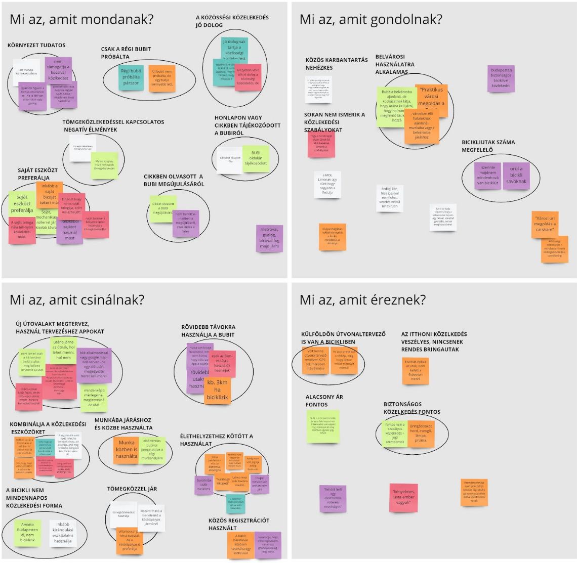
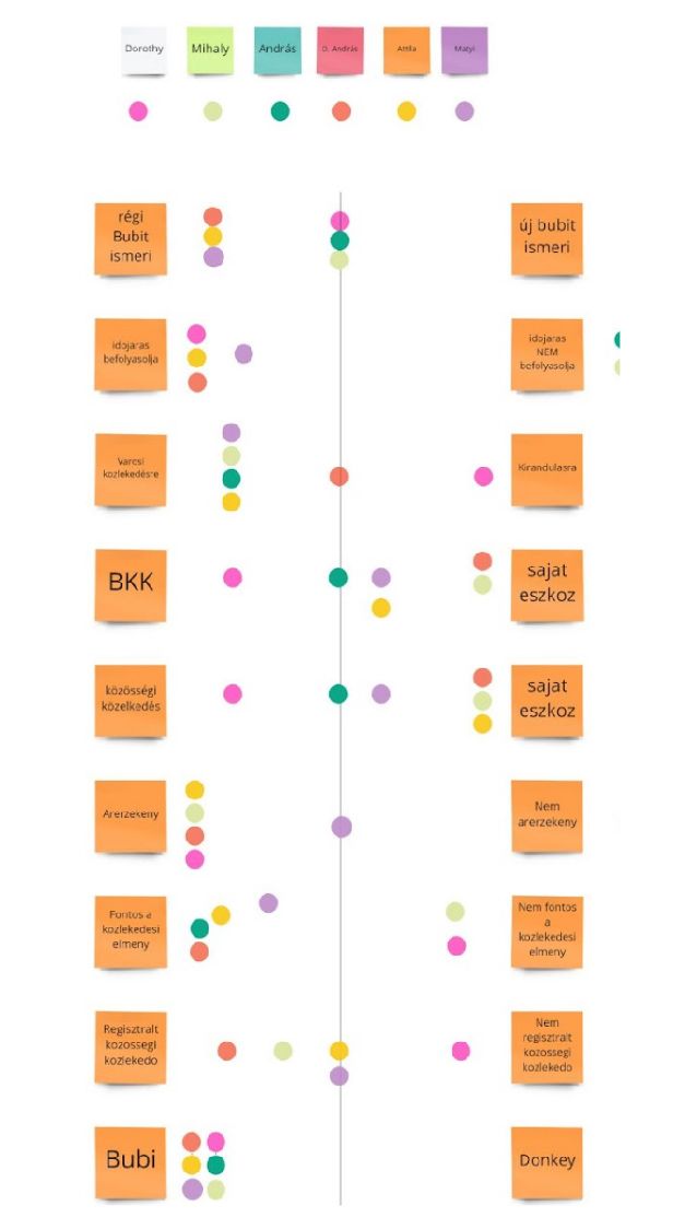
We used several methodologies, such as desk research, user interview, survey, usability test and one-click test. To visualise the data, we used affinity diagrams and empathy maps. The results of the survey can be found here (Hungarian only).
Recruitment criteria and process
For this study, we were looking for a mixture of users and non-users. We did this because we wanted to make sure we got a comprehensive perspective of the service, and see how first-time users respond to the flow and experience. This helped us to ensure we weren’t just looking at power users who were "used to" the service.
We wanted to target 2 user groups by the following criterias:
-
Group A:
- Lives or works in Budapest
- Age: 20-45
- Digitally mature (paid for something online at least once in their lifetime)
- Used, or still uses a community based public transport service
-
Group B:
- Lives or works in Budapest
- Age: 20-45
- Digitally mature
- Never used any kind of community based public transport service
Analysis and synthesis process
We recorded every interview, and took notes. We have analysed these with the help of our mentor and with the instructors. We put the facts on an empathy map, and used an affinity diagram too.


Usability test process
To test the process fully, we created a prototype of the mobile application in Figma. Since we had a bad weather and also COVID-19 restrictions were in order, we didn’t have the option to meet in person so we had to choose this method.
The participants shared their screen in Zoom, and followed our detailed instructions. We made up a little story to make them feel more connected to the test. We split up to the testing to three tasks:
- Sign up, fill out the required fields
- Explore the pricing options and buy a monthly ticket
- Find the nearest bike and rent it
One-click test results
The usability test suggested that the sign up was not obvious, but I didn’t fully agree, because one of our three participants had a technical difficulty, and after solving it, he was way too nervous to fully pay attention, he just rushed over the test. Two out of one was stuck a little bit on the process, so only one person doesn’t indicate that there are any issues finding the sign up button. After sharing the test, 75 people responded and 78% of them found the right button (the app has several buttons for reaching the registration form).
Conclusion
Most people like the bike-sharing system, because it’s cheap, easy to use and always available. They usually use it for going to, or coming home from a party or an event. Interviews showed that time was important for the users, so probably in these scenarios it doesn’t matter if the ride takes 10 minutes or 20, while when they are going to work, they want to get there quickly and in time.
The satisfaction with the service highly depends on which districts people live or work at, because in the downtown area, there are a lot more docking stations than in the outskirts.
People who use it regularly said that it’s really comfortable that you don’t have to take care of a self owned bike. No maintenance fees, don’t have to stress about how and where to store it.
Those who use it rarely mentioned several issues why they don’t really prefer the bike-sharing system:
- Their own bicycle has a much better quality, and it’s more faster
- Weather is unpredictable, they can’t rely on that
- There are very few bicycle roads, and riding between cars and buses seem very dangerous to them
Other transportation types, like shared cars, received positive feedbacks, but people don't combine it with other methods. The most negative review came for the scooters. People find them extremely dangerous and expensive.
Reflections
What went well:
- We had really good interviews
- The survey gave us answers to our hypotheses
- We learned a lot about user research and Mol Bubi!
Challenges:
- Doing it online affects the behaviour of the user. They seem more uncomfortable talking to a screen instead of a real person
- The prototype wasn’t 100% accurate, but didn’t have time to make it perfect
