UX case study: enhancing the marketing event creation process
I was responsible redesigning and enhancing the user experience of an internal CRM tool mainly used by marketing people, but there were several sales, and other users from different organisations as well. The number of active users was over 3000.
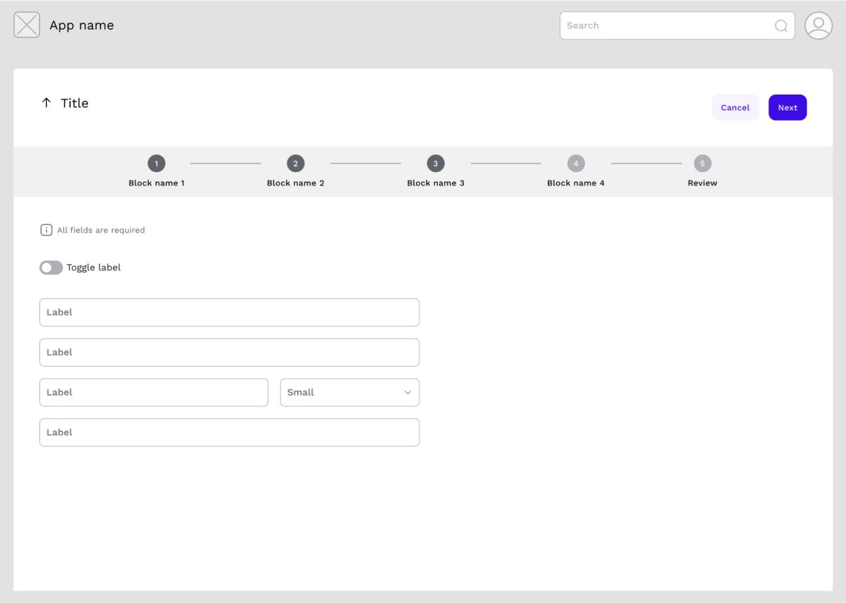
Disclaimer: Due to a signed Non-Disclosure Agreement (NDA) for this project, I am unable to share actual screens, names, Key Performance Indicators (KPIs), and other specific metrics. Consequently, the numbers presented are fabricated but are proportionally similar to the real ones. Additionally, the wireframes provided are for illustrative purposes only and are intended to help visualise the problem.
Intro
The primary usage of the application was to create marketing events to keep track of marketing related information, such as budgets, contact details, and so on. The application was quite simple, but since they never had a UX professional working on it, it had several usability and accessibility issues. I learned these when I facilitated a discovery research when I joined the team.
I was collaborating with several people on this project, including the development team, a people of 6, the stakeholders with 5 members, and the overall process was overseen by the sales operations, whose job was to operate the business and define requirements.
The team and I decided to proceed with the redesign process in small increments, because the development team was small compared to how much work they had. They not only had to add new features, but they also had operational duties like supporting the application and the users.
The task
One of the incoming tasks was to add a new set of input fields to the event creation process. This page was already filled with over thirty input fields without any logical organisation, and consistency. We had feedback that it was difficult to make sense of, even for someone who used it several times before.
I suggested that if we are going to work on this, how about we also redesign this part, enhancing the user experience, and removing the barely used fields. This could boost the effectiveness of our users, creating events faster, seamlessly.
The stakeholders supported the idea, as did the development team, but since they already had a lot on their plates, they asked me to only change what is really necessary to improve the usage and the user experience.
I started preparing research to learn how the users interacted with this part of the app, what are their goals, how they are benefiting from this, and what are their pain points, their desires.
Preparing for the user interview
I decided to do a 1:1 interview session with 10 people, who were internal users. One would think, it is easy to recruit internally, but sadly, we didn’t have a platform, mailing list, nor Slack channel to reach all of the users, so I had to rely on the stakeholders for the recruiting process. I asked for users from every age, gender, location, and position, ideally not a beginner who just joined the company (to separate first time confusions from recurring usability issues), nor a super user who has their own way of workaround for the application.
I used Zoom and interviewed people from the US, India, and UK. We had a travel freeze during this time, so couldn’t travel and meet in person.
I’ve recorded every session and analysed the data afterwards. I prepared an interview script with a list of questions and tasks for the users to perform. I asked the users to provide context: what do they use the application for, and how did creating events fit into their workflow, what were their ultimate goals? Then I asked them to use the program creation page as if they would normally do and fill out the form they typically do as I observed how and what they are doing.
For analysing the data, I used an empathy map and affinity diagram. I searched for themes, recurring pain points.
What did we learn from the users
During the interview sessions, it became evident that the fields the sales leaders wanted to add to the creation process — specifically, partner data — would not be filled out frequently. I suggested using a data-driven approach to determine the percentage of active events in the system that utilised this information.
Out of 2,000 events, only 100 included this information — less than 10%.
This information was essentially an edge case, required only for very specific events. Adding it to the creation process would not lead to more partner data being provided but could result in frustrated users. When I did my first discovery research on the whole application, I learned that users usually want to finish fast with the creation process, because they want to move on to the next task, like creating budgets, which was a long process because it required several approvals.
I shared my findings and concerns with the rest of the team, and they did agree that this doesn’t make sense in this form, but there was a hard push from the business side.
In the initial project discussions with the sales lead team, it became clear that they preferred using factual data rather than opinions to make decisions, so I conducted an A/B usability testing. I know, it’s not a common method, but I had to test my theories. I have created two designs. Both included the reimagined flow, which was adding train steps to make a more clear, and obvious form for the users. In version A, I added the partner data as a train step, but it could have been skipped.
In version B, I added a switch to a step where the user itself could turn on the partner data step. If they turned it on, meaning they got partner data, an extra step appeared in the train.

Before I started the test, I ran the design by the stakeholders and the development team. After I got their feedback, I adjusted the designs accordingly then moved to the testing phase.
Usability testing
For the test, I spoke with 6 people, individually, online. For testing, I used Figma prototypes.
To avoid question-order bias, I switched the order of the designs with each interviewee. Person 1 had to test A then B. Person 2 started with B, then A, and so on.
In the end, both designs had flaws and good solutions, but most importantly, the vast majority loved the switch! Even those people who often fill out the partner data, because they don’t always want to / have to provide this information, and this solution can save time.
I shared the results with the stakeholders, and they loved it. They spoke with the sales ops and they also accepted my approach.
After making some refinements, the design was ready to be implemented in the application.
Final thoughts
I kept everyone in the loop during the whole process, to avoid extra work, and confusion. To reduce development time, I only changed what was really necessary, for example, some input fields where clickable to select an item from a list, behaved differently from another one with the same functionality. Before, I worked as a front-end developer, so I knew that changing this was not that easy, and since the dev team already had a huge backlog, I tried to minimise their work.
The A/B testing was an interesting way to test two possible solutions, but I won’t say it’s 100% fail proof. I felt that the design that came second was always different for the users, because they already knew 70% of the flow, they weren’t that thorough, they spent less time on it.
Additionally, six participants didn't provide enough data, but I didn't have time to recruit more.
