UX audit: enhancing usability in a facility management application
Thoroughly examined its accessibility and usability, keeping the fundamentals of UX in mind. My evaluation identified key areas for improvement, aiming to enhance the overall user experience and functionality of the tool.
Goals
The goal was to discover UX flaws and potential user pain points. The customer was aware of the app’s application's outdated visual and functional aspects, and they wanted something fresh and modern for their users so I provided them with a detailed report, with examples and actionable items.

Methodology
In this case study, I was using cognitive walkthrough to evaluate our product's usability. It focuses on the user's perspective by narrowing the scope to tasks needed to complete specific user goals. But since there are no actual users to conduct a usability test, I am investigating by following the laws of UX to reduce bias.
Outcome
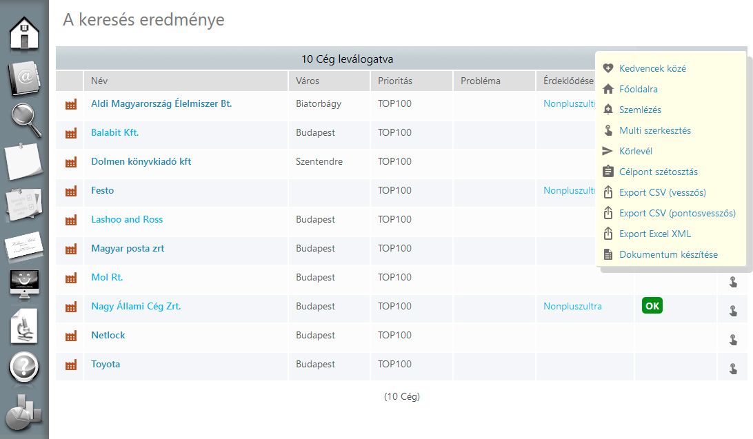
- Look and feel of the tool: the design was outdated compared to modern standards, and inconsistent in several parts. I provided detailed examples, reasoning and solutions for enhancing the current design without actually redesigning the whole application. This approach was easier to adapt and saved time and money for the client.
- Accessibility: I provided a list of crucial accessibility issues, including failing contrast ratios, small font sizes, missing image attributes, and a lack of keyboard navigation options.
- Overall layout: several parts of the UI were built up in a non standard way. For example, the filtering of a table was far below the table, it wasn’t obvious that these belong together which could confuse the user.
- Copy: the copy lacked a human-centred approach. Labels, titles, and various text elements seemed more like placeholders or database entries than user-friendly content. Additionally, the use of business jargon may have been confusing for new users or those who don't use the tool regularly.
- Features: I discovered several seemingly unused features within the app and recommended conducting research to learn if people are using these, if not, why not.. I provided a list of methodologies for this purpose. Removing any redundant features can save the client money and resources, while also providing users with a cleaner layout.
