Heuristic evaluation of Wallet, a budget tracking app
As part of my UX Designer course at Uxcel, I conducted a heuristic evaluation of the Wallet app, focusing on usability and interface design. Through systematic analysis, I identified usability gaps and provided actionable recommendations to enhance the app's user experience.
The heuristic evaluation is a method aimed at evaluating the usability of an interface based on a set of principles created by Jakob Nielsen.
For the evaluation process, I utilized NNg's heuristic evaluation workbook, which includes a brief description of each heuristic metric along with some examples.
The project I've selected is a finance managing app that I use every day. It helps me keep track of my earnings, spending, budgets, and upcoming payments. The app varies between desktop and mobile versions, with several features not available in the web app.
I've been using this app for years, and while it meets my needs, it has several UX and usability issues. As I embark on my journey as a UX designer, I aim to address these issues and enhance my skills in the field.
Visibility of System Status
The design should always keep users informed about what is going on, through appropriate feedback within a reasonable amount of time.
Issues
Adding a new record doesn't provide any visual feedback on the Dashboard. Although the charts reload, the new record isn't visible.
Recommendations
To enhance the user experience, consider implementing a toast message confirming the successful creation of a record.
Match Between System and the Real World
The design should speak the users' language. Use words, phrases, and concepts familiar to the user, rather than internal jargon. Follow real-world conventions, making information appear in a natural and logical order.
Issues
The loading screen currently features the application logo and a label stating "data initialization". After a few seconds, the dashboard appears, but the widgets are displayed as skeleton elements to simulate loading again.
Recommendations
Consider removing the splash screen altogether and refraining from using terms like "data initialization." Instead, simulate the loading process by displaying the dashboard with skeleton loading elements. This approach helps users understand that data is being loaded, without explicitly stating it.
User Control and Freedom
Users often perform actions by mistake. They need a clearly marked "emergency exit" to leave the unwanted action without having to go through an extended process.
Issues
Currently, there are no undo or redo buttons available in the app. After creating a new record from the dashboard, the user needs to navigate to the records page, select the item, and then edit it. Similarly, there's no option to undo a deletion once an item is removed.
Recommendations
As part of the toast message which confirms the successful creation of the record, include an "undo" link within the message to allow users to easily revert the action if needed. This way, users receive immediate feedback and have the option to undo the action without navigating to a separate menu.
Consistency and Standards
Users should not have to wonder whether different words, situations, or actions mean the same thing. Follow platform and industry conventions.
Issues
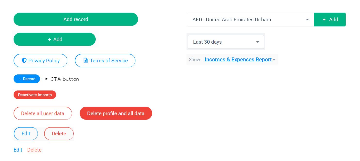
There are inconsistencies in various UI elements. Buttons and dropdowns have multiple designs, leading to confusion. Additionally, the call-to-action (CTA) button is smaller than regular buttons, making it less noticeable and diminishing its effectiveness in drawing attention.

Recommendations
To achieve a consistent look, ensure that all buttons in the interface have the same size, and color based on their functionality. This uniformity enhances visual coherence and improves the overall user experience.
Error Prevention
Good error messages are important, but the best designs carefully prevent problems from occurring in the first place. Either eliminate error-prone conditions, or check for them and present users with a confirmation option before they commit to the action.
Issues
When creating a new record, clicking outside the modal currently closes it, resulting in the loss of all the entered data.
Recommendations
To address this issue, you can modify the behavior of the modal so that it remains open when users click outside of it while creating a new record. Instead of automatically closing, provide a cancel button within the modal. This way, users have the option to cancel the process of adding a new record without losing any entered data.
Recognition Rather Than Recall
Minimize the user's memory load by making elements, actions, and options visible. The user should not have to remember information from one part of the interface to another. Information required to use the design (e.g. field labels or menu items) should be visible or easily retrievable when needed.
Issues
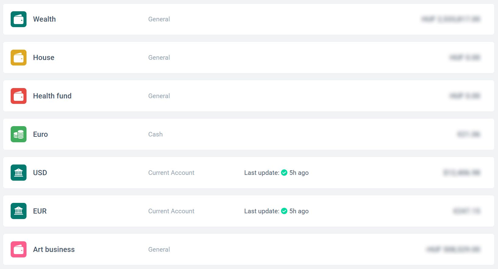
The Accounts tab currently does not indicate whether an account is active or inactive.

Recommendations
Consider displaying a visual indicator or message within the Accounts tab to help users identify which accounts are active and which ones are inactive.
Flexibility and Efficiency of Use
Shortcuts — hidden from novice users — may speed up the interaction for the expert user such that the design can cater to both inexperienced and experienced users. Allow users to tailor frequent actions.
Issues
Keyboard navigation appears to be inconsistent, as it functions in some parts of the app but not in others. Specifically, when creating a record, users are unable to select a category, label, date, or save their entries using the keyboard.
Recommendations
To enhance user accessibility, ensure thorough keyboard navigation throughout the app. Users should be able to navigate and interact with all elements, including selecting categories, labels, and dates, solely using keyboard inputs. Additionally, implement keyboard shortcuts for common actions, such as using the ESC button to close modals.
Aesthetic and Minimalist Design
Interfaces should not contain information that is irrelevant or rarely needed. Every extra unit of information in an interface competes with the relevant units of information and diminishes their relative visibility.
Issues
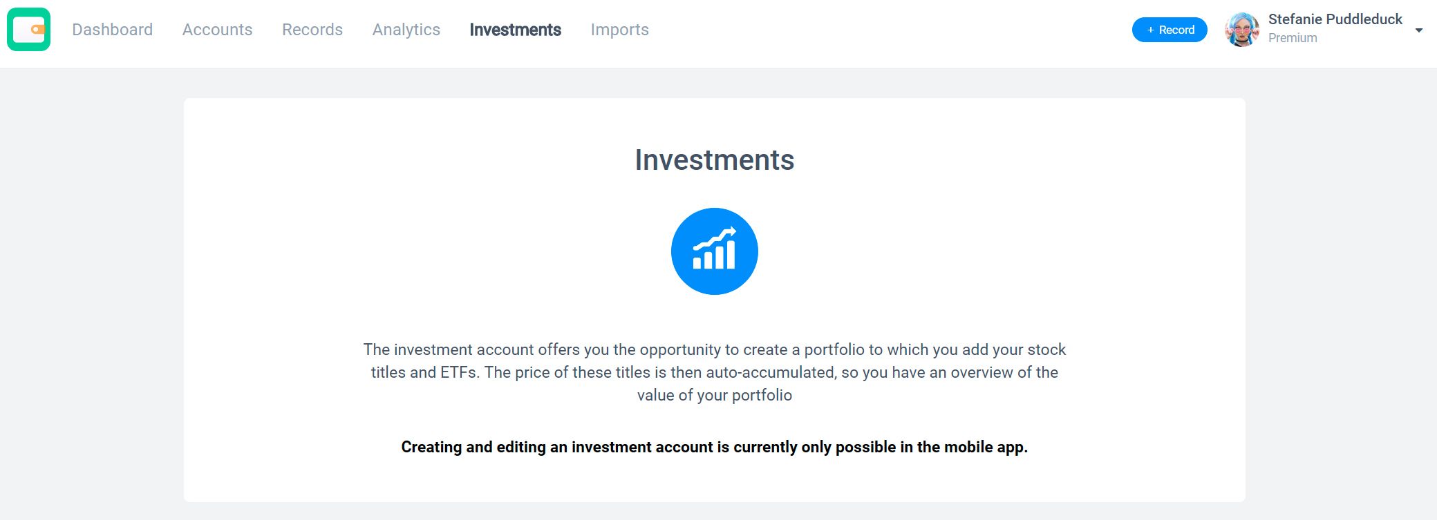
It seems that certain features, like Investments, are exclusive to the mobile app, yet they remain accessible in the main navigation of the desktop version, seeing a message that this is only available in the mobile app. Additionally, the Import option in the main navigation might be unnecessary for less advanced users. Consider optimizing the desktop navigation menu to only display features that are relevant and usable on that platform, improving the overall user experience.

Recommendations
Consider hiding functionalities that are exclusive to the mobile app or those that do not function on the desktop platform. By removing inaccessible features from the desktop interface, you can declutter the navigation menu and prevent users from encountering non-functional elements.
Help Users Recognize, Diagnose, and Recover from Errors
Error messages should be expressed in plain language (no error codes), precisely indicate the problem, and constructively suggest a solution.
Issues
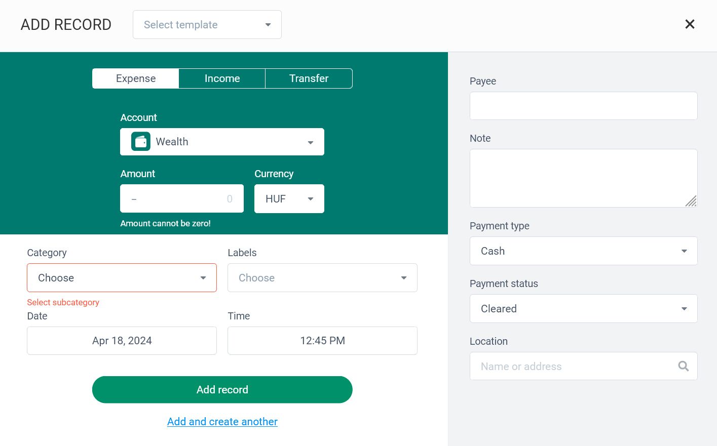
It appears there are two distinct designs for displaying empty input fields on the record creation modal. However, the first design is not easily recognizable as it blends in with the overall design scheme.

Recommendations
To enhance user experience, strive for a consistent visual presentation when displaying errors. This uniformity aids users in quickly identifying and addressing errors.
Help and Documentation
It’s best if the system doesn’t need any additional explanation. However, it may be necessary to provide documentation to help users understand how to complete their tasks.
Issues
On the desktop app, users are unable to view and edit their personal information, such as their email address, although they can change their password or delete their account. Users are not provided with any message or information regarding these limitations. This lack of communication may lead to confusion or frustration among users who attempt to perform these actions on the desktop app.
Recommendations
Ensure that users have the ability to edit their personal information on all platforms. Avoid limiting this functionality to one platform, as it may inconvenience users and create a disjointed experience.
