UX evaluation of használtautó.hu's search functionality
The evaluation of használtautó.hu's search functionality examines the key issues affecting user experience in the site's search feature. This study provides actionable recommendations to enhance usability and improve overall user satisfaction.
The original study was written in Hungarian because the website and the company are Hungarian-based.
Purpose of the project
The aim of the project is to conduct an analysis and formulate recommendations related to the test task for the UI/UX designer position advertised by használtautó.hu.
The main focus is on analyzing and evaluating the search functionality found on the website. As part of the task, I identified the current strengths and weaknesses of the search feature and provided suggestions to improve usability and user experience.
Prerequisites
As a first step, I would conduct a qualitative study on the current usability of the site. Through user interviews, I would examine how visitors use the search function, what they find lacking, and what problems they encounter.
In the next step, I would perform data analysis to determine the most frequently used filtering options, which I would then highlight in the main search function. I would limit the number of these options to avoid making the interface too complex and overwhelming for the users.
Brand selector
Current behaviour
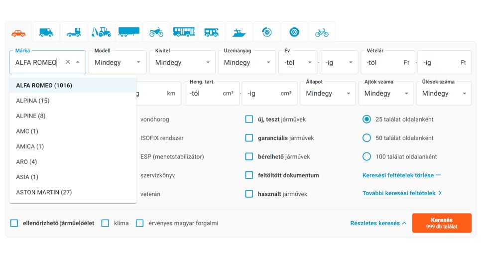
- Currently, I can select only one brand, with no option to choose multiple brands.
- The brand names and the available quantities blend together, making it difficult to browse and find what I'm looking for.
Recommendations for improving the usability
- Clear visual layout of list items with increased spacing.
- Displaying the logo of each brand to enhance searchability.
- Clearly distinguishable quantities to allow users to easily determine the available quantity for each brand.
- Adding checkboxes at the end of list items to enable users to select more than one option. Additionally, providing immediate feedback if a user clicks accidentally, allowing them to correct it on the spot.
Model selector
Current behaviour
- Currently, I can select only one model per brand, with no option to choose multiple models.
- The model names and the available quantities also blend together, making it difficult to browse and find what I'm looking for. This is particularly problematic when the model name consists solely of numbers (as seen in the case of Peugeot).
Recommendations for improving the usability
- Clear visual layout of list items with increased spacing.
- Clearly distinguishable quantities to allow users to easily determine the available quantity for each model.
- Adding checkboxes at the end of list items to enable users to select more than one option. Additionally, providing immediate feedback if a user clicks accidentally, allowing them to correct it on the spot.
Other dropdown elements
Current behaviour
- The list is very long, and on smaller resolutions, it often extends beyond the screen and covers the selected field, obscuring its name.
- I cannot search textually within them, which could expedite the selection process.
- I cannot navigate within them using the keyboard; I can only select the top item, but I cannot move further down the list.
- Their appearance also significantly differs from that of the Brand and Model selectors; for instance, the quantity is not accessible here.
Recommendations for improving the usability
- Standardizing all dropdown elements to ensure they fit within the screen and allow for textual searching.
- Implementing clear visual layout of list items with increased spacing.
- Displaying the available quantity similarly to the Brand and Model selectors.
- If a brand/model does not have, for example, an electric version, I would make that option unavailable (disabled), clearly indicating to the user that such an option does not exist.
- Adding checkboxes at the end of list items to enable users to select more than one option. Additionally, providing immediate feedback if a user clicks accidentally, allowing them to correct it on the spot.
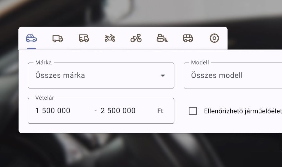
Price Selector
Current behaviour
- The fields blend too much with the rest, making it difficult to distinguish which ones are the 'from' and 'to' price input fields.
- Currently, I can only manually enter the price, which can be inconvenient and time-consuming for some users.
Recommendations for improving the usability

- I would visually group the Purchase Price fields to clearly distinguish them from the rest.
- I would supplement the text input fields with a slider (range selector) component, allowing users to enter the amount more quickly with just one click. I would conduct research to determine which method is more effective for users.
Visual elements

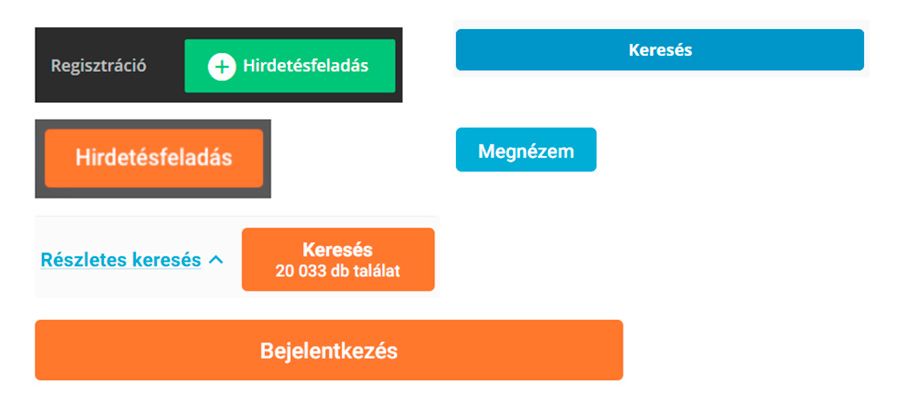
- On the homepage, there are several different visual appearances for buttons, which hinders usability, trust, and visual consistency. The WCAG (Web Content Accessibility Guidelines) provides more detailed insight into why this is a problem.
- The color of the Search button may evoke a sense of destructiveness. While it follows the brand's colors, it might be worth reconsidering and working with slightly more neutral tones.
Other observations

- After selecting a brand, the displayed quantity in the list differs from the number shown on the Search button. This inconsistency can be misleading and frustrating for users.
- The 'Reset' button is hidden behind the 'Advanced Search,' which is not intuitive. It would be more logical to place it next to the Search button, allowing users to quickly clear their previous selections with one click.
- Clicking on the 'Advanced Search' button only reveals a limited number of options; the fully detailed search requires an additional click.
- The category selector at the top of the search is usable with the keyboard, and a tooltip appears when selected. However, the lack of focus state makes it difficult to determine if the category is clickable.
Prorotype in Figma

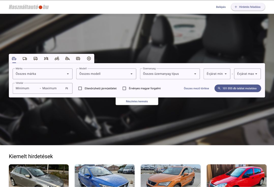
I've created a simple prototype to provide a more detailed presentation of the layout and functionality of each element.
- Only certain brands (Hyundai, Toyota) and models (i20, Aygo, Yaris) can be selected.
- Due to Figma's limitations, some hover and focus states are missing in certain areas.
- The displayed values in the Price input field changes only on click.
